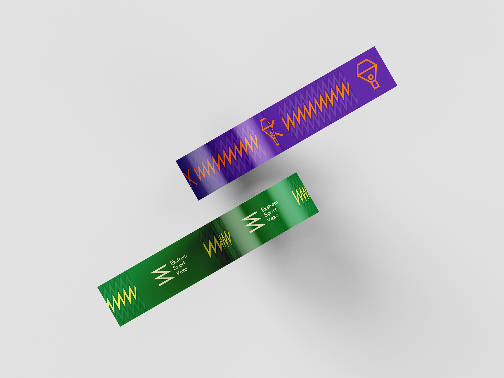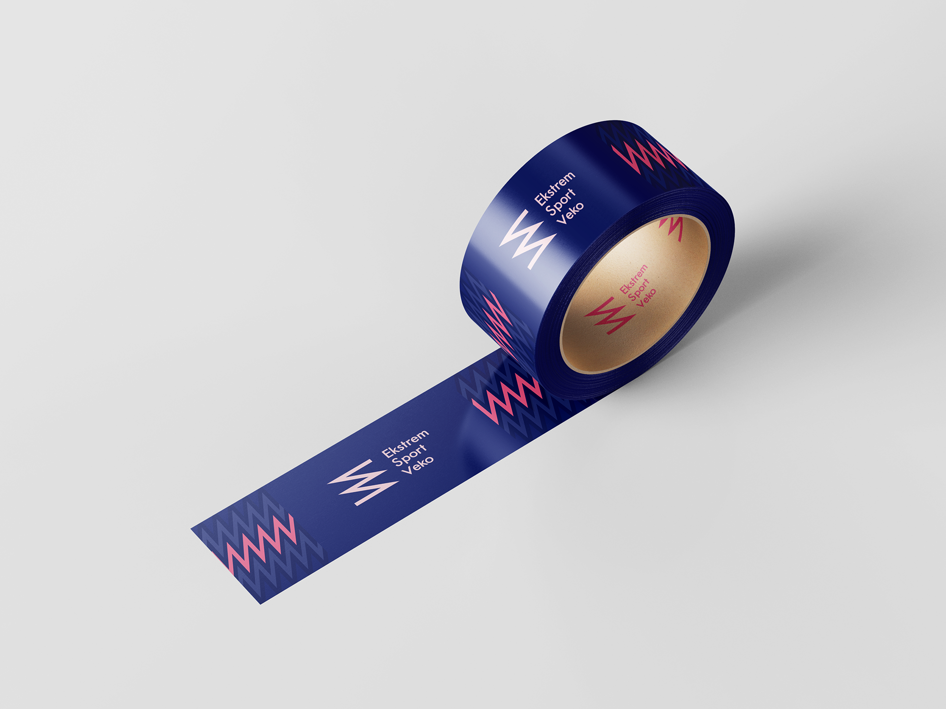

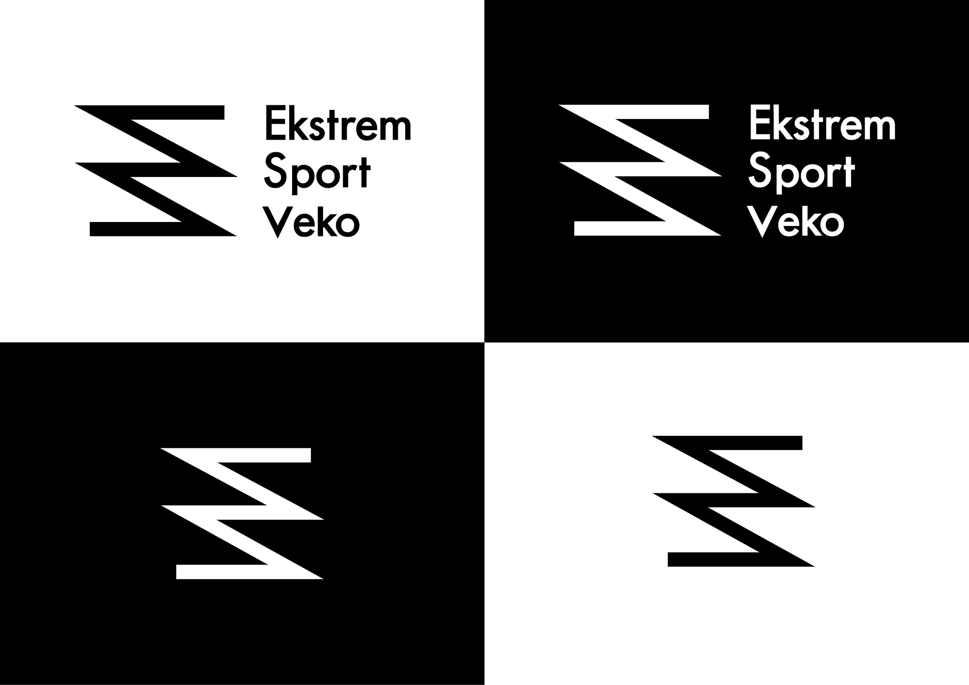
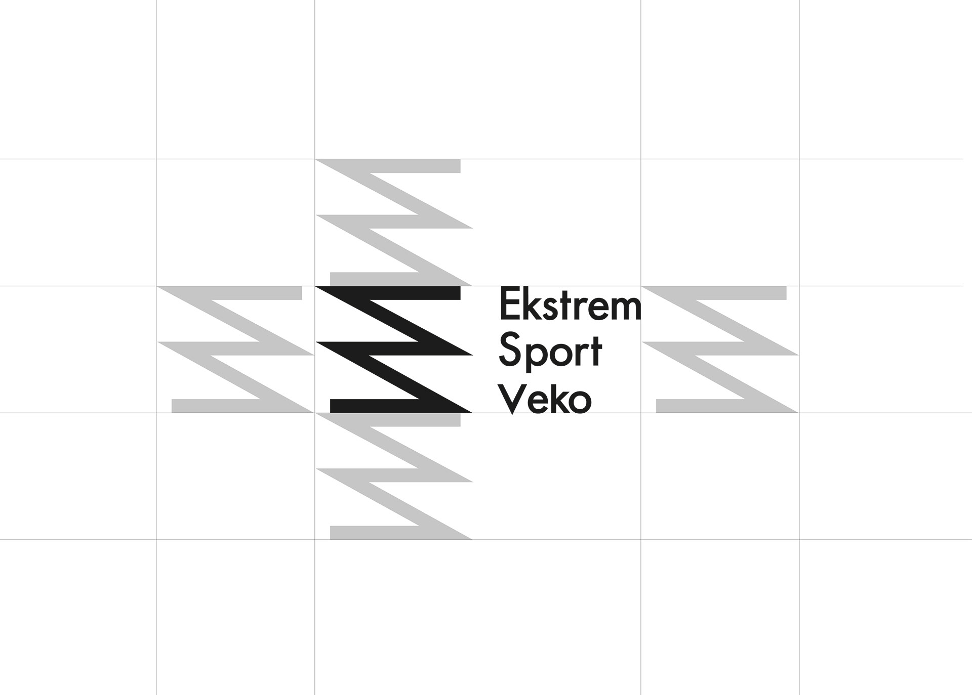
The redesigned logo illustrates speed and movement using sharp lines. The design of the logo provides simple opportunities for animation, where the concept of passion can be reinforced through concrete ideas of pulse, terrain, and rapid movements – all common denominators for extreme sports.
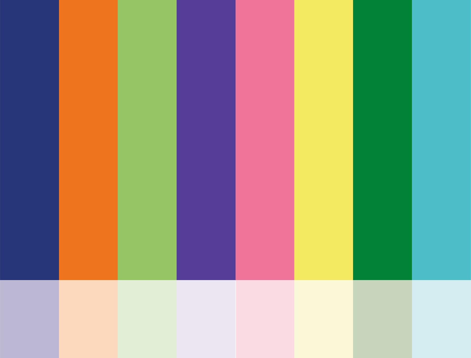
The colors are chosen based on the key values and are intended to create a playful and vibrant design. The primary colors will be used to catch attention and frame the hierarchy for posters and other display surfaces. The supporting color palette consists of a 30% gradient of the primary colors and is intended for typography in small point size to harmonize with the layout's color choices. Ideally, they should be placed in the complementary color to the background color.
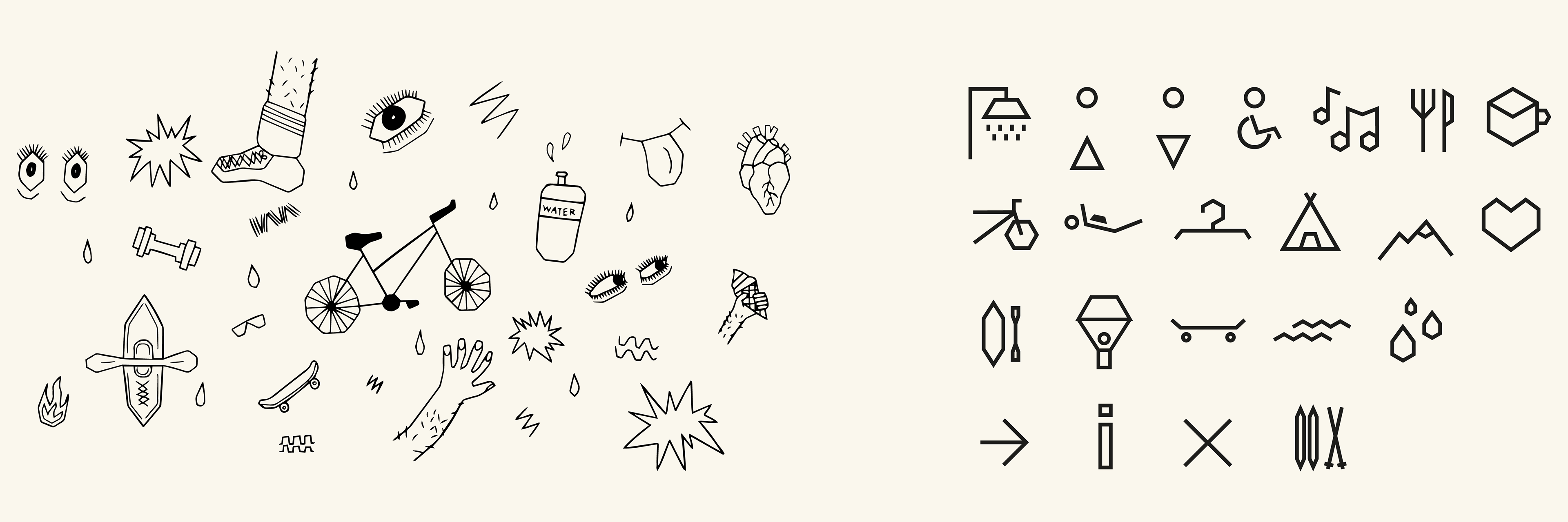
Illustrasjoner og ikoner
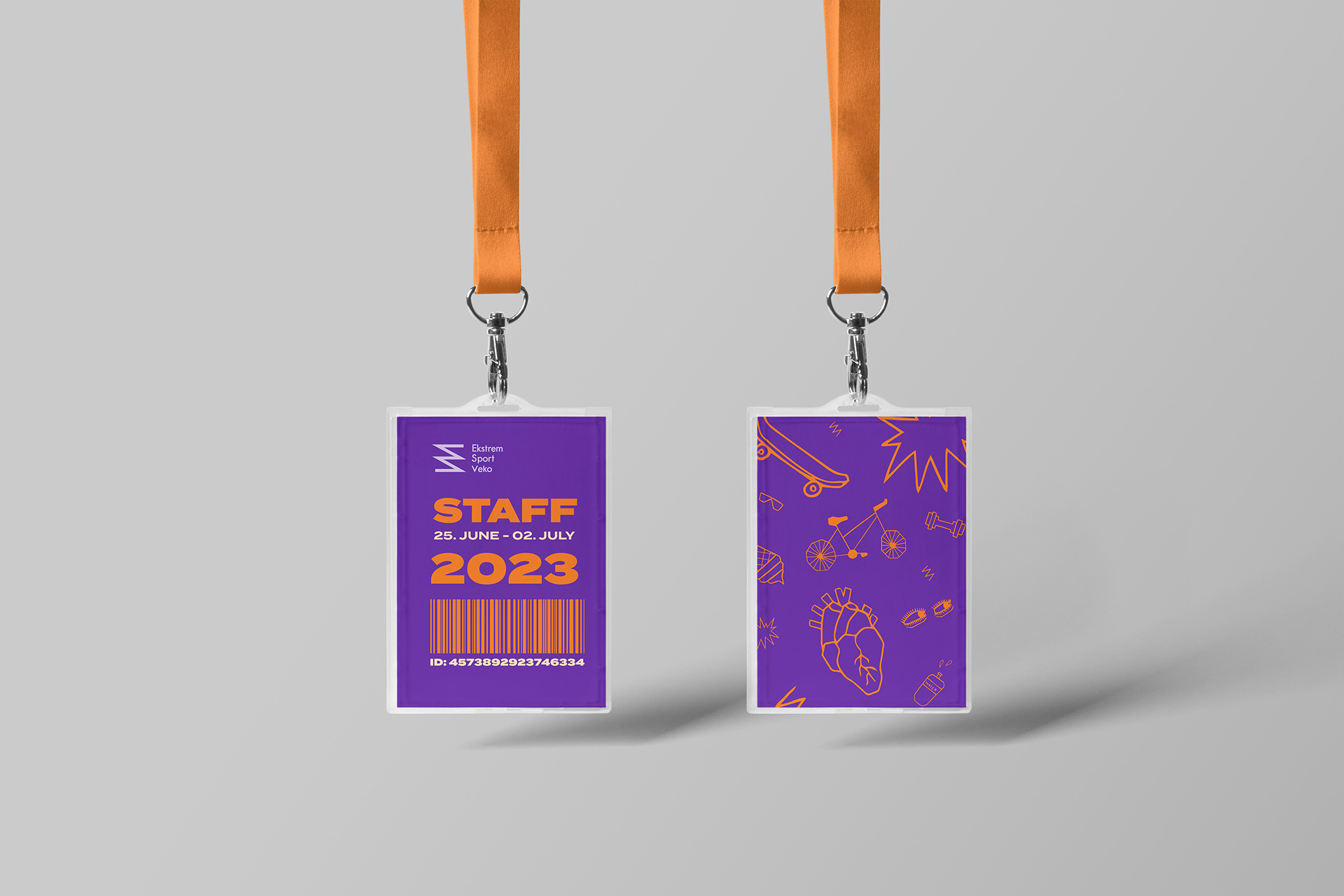
The completed icons are designed with sharp edges, drawing inspiration from the hexagon, which is extracted as a fragment from the adrenaline molecule.
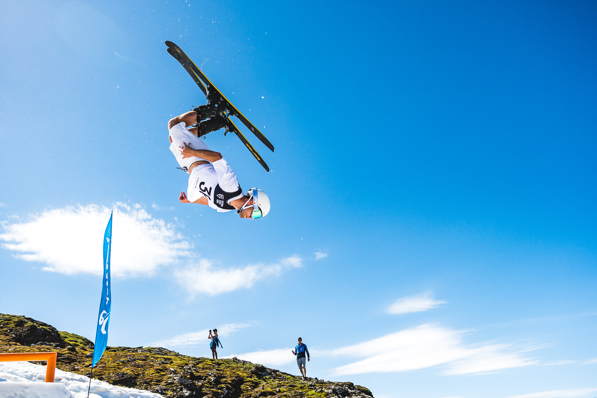
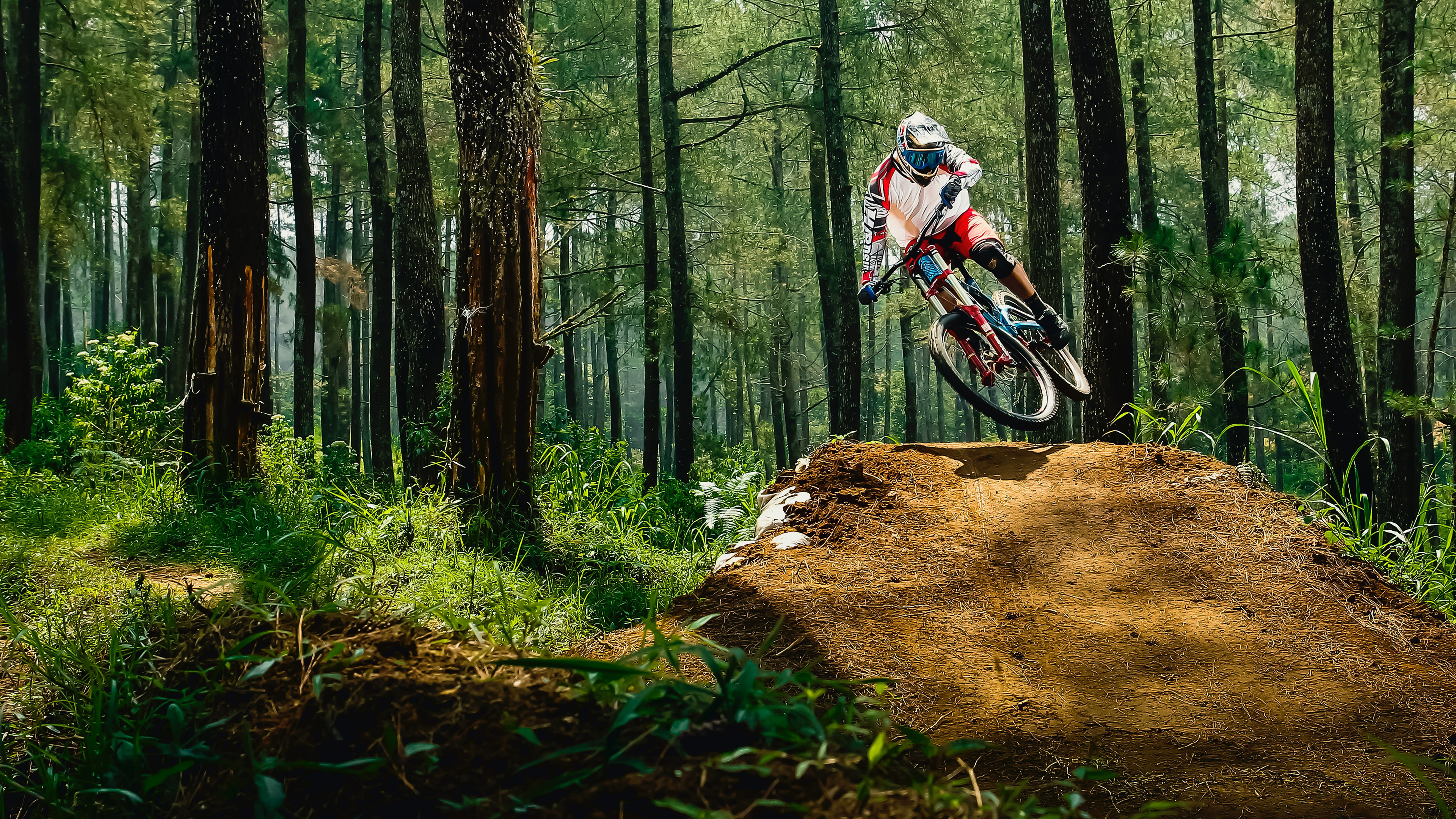
We aimed to create illustrations that contrast with the sharp and edgy expression of the rest of the design. We worked based on the values of movement, playfulness, and minimalism.

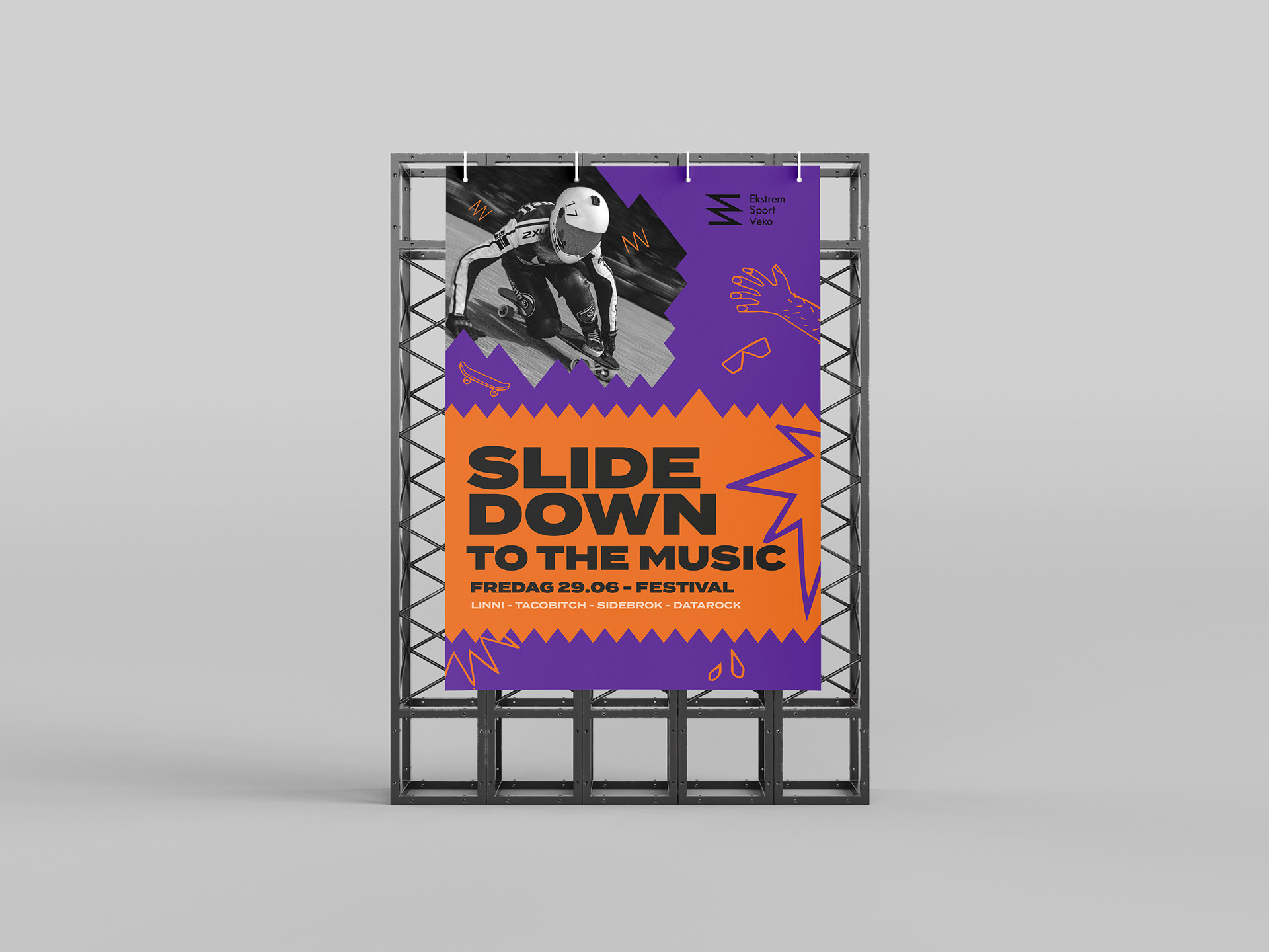
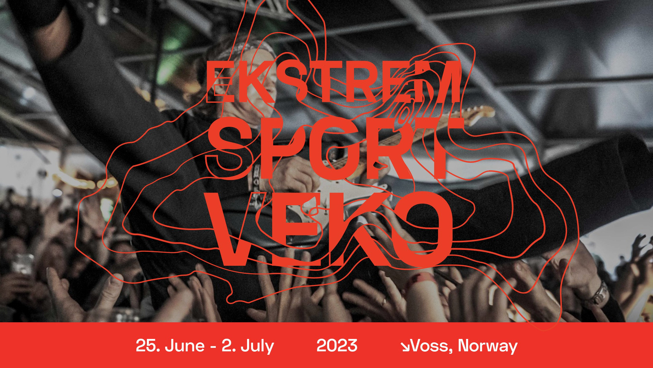
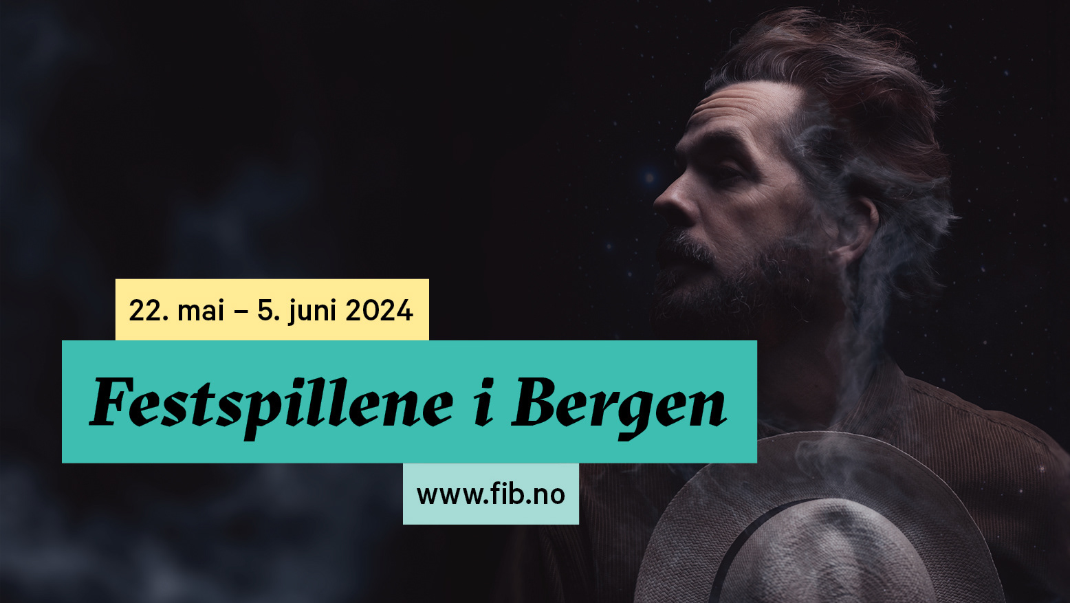
Posters
We wanted to use bold colors in the design elements, contrasting with our black & white image style. Sharp/hard shapes in different directions are meant to evoke a sense of movement along with the images. The shapes are positioned around the image to create the feeling of it "shooting" through the design.